It’s an unwritten law: spend big £/$ on a TV campaign and your website traffic will go through the roof.
Your overall cost per visitor will naturally follow suit. So how do you get more out of the traffic you’re buying in?
The answer is pretty simple – conversion rate optimisation. Test and tweak your pages and processes until you can get more people doing much more of the things you want them to do.
A case study in conversion rate optimisation
The company I work for – Jobsite.co.uk – is into its 2nd year of TV advertising. The traffic levels during the campaigns have been incredible (see graph below for search query peaks during two TV bursts).
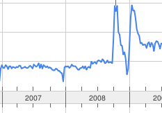
UK search trends for ‘jobsite’ – Google Trends
Whilst looking at the data, I wondered what the impact on conversion rates would be if we used the same imagery from the TV ad on the site’s homepage search box. Would it encourage more searches?
As we were about to run another burst of TV advertising in January 2010, we had a prime opportunity to do some conversion testing to find out.
If you’ve worked on a brand’s website during its TV campaign you’ll be familiar with the following traffic pattern: a tremendous surge during the ad period, followed by a gradual, not sudden, drop during the subsequent weeks – known as the ‘Halo Effect’. In our case, TV ads aired throughout January, with the halo effect running into February.
The conversion test
I wanted to test 3 things:
- What impact would TV imagery have during the TV period?
- What impact would it have during the halo?
- What impact would it have during a ‘normal’ month?
When testing, you need to identify which conversion metric you are looking to improve. Given the nature of our site, my preference tends to be job applications or CV (resume) uploads. However, in this instance, I felt there were too many variables that could influence either metric (particularly the fact that jobseekers often leave the website to prepare their application before returning in a separate session to apply). So for this test I chose to track on site job searches.
Could switching the search box imagery from the default stock photo of people over to the TV image (featuring British actor, Max Beesley) actually increase the number of visitors that become searchers?
Rather than a simple A/B test (Max vs the People), we ran multivariate tests, featuring variations of the search box heading, the search field label and the imagery. This would give us insight into which element(s) improved the number of searches.
Results during TV
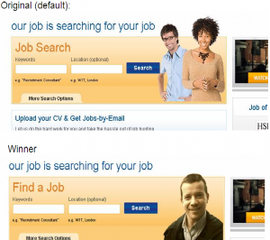
As expected, the winning page combination during the January TV campaign was a version that featured Max Beesley. Based on the visitor figures for the month, running this version on 100% of visits would have resulted in an additional 11,328 job searches.
The % uplift over the default version was not dramatic – a 1.3% increase – but sufficient enough to be noticeable when you’re dealing with a highly trafficked website.
What was clear with this test, however, was that the heading ‘Find a Job’ outperformed the default heading ‘Job Search‘, with an 87% chance of beating the original headline (on the default version).
Into the Halo Effect
Things began to change in February with the ‘halo effect’. Traffic to the site was still high, TV had stopped but other digital brand advertising (PPC, Mobile pre-rolls) continued.
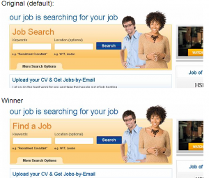
The same Max variant continued to outperform the original, but its impact had begun to decline (down to +1.0% over the original combination). In fact, it had slipped into 2nd place, behind a variant using the original stock library image (+1.18% over the original combo). Based on February traffic figures this new lead variant would have generated an additional 8,181 searches if the creative had run for 100% of visits.
The impetus for this performance increase was the heading ‘Find a Job’ (+1.09% over the original heading) – the call to action was more of a factor than the choice of image at this stage.
Interestingly, we also saw a rise in the performance of a 2nd heading – ‘Search Jobs’ – amongst the successful variants (+0.93% over the original)
Under ‘normal’ conditions
As we moved into March, there was enough distance from the high profile ‘Above the Line’ activity to consider it a ‘normal’ environment.
Of the 19 variants we were testing, only 3 outperformed the original – and just barely. All three made use of the stock library imagery. The best performing variant was almost identical to the original, with the only difference being a heading of ‘Search Jobs’ instead of ‘Job Search’ (a simple switch of word order creating a call to action instead of a description).
This variant increased searches by 0.32% over the original – extrapolated to 2,338 extra searches in March.
When you look at the individual components’ performance, ‘Find a Job’ was still marginally ahead of ‘Search Jobs’ (+0.54% to +0.52% improvement on the original), but in combination with the other elements, the latter featured in the best performing variant throughout March.
Interestingly, if we’d used the best performing TV imagery variant in March, it would have resulted in 1,169 FEWER searches than the original.
Learnings from conversion testing
Overall, we can conclude from this test that the use of TV imagery within your search box DOES improve your conversion ratio of visitor to searcher during your campaign. However, it should be coupled with a strong call to action to maximise its impact. In this case study, it provided the possibility of 22,000+ additional searches over the 3 months.
So what else can we take from this test?
In general terms, I would recommend the following tips:
- Continuous testing is important – external influencing factors, e.g. advertising campaigns, news, events and seasonality, can impact the conversion performance of your site. Test and change your design accordingly
- Give consideration to your use of imagery – its not there just for aesthetics. It can be a powerful aid to conversion
- Use clear Calls to Action in your copy, especially titles and/or buttons. Stick to a single call to action in a creative to avoid mixed messages
In regards to Jobsite, we’ll be returning to TV again next month (May ’10). My specific recommendations are:
- Use TV imagery and ‘Find a Job’ title throughout the broadcast period
- Continue with same creative for first fortnight of halo effect period
- Switch back to original creative thereafter but with a call to action in the title – either ‘Search Jobs’ or ‘Find a Job’
- Continue testing – introduce new variant options, such as alternative imagery, text, buttons or even background color.
As with all conversion testing, this isn’t a blue print for success with your own website. You’ll have your own set of external factors to contend with, your own site design and product offering to influence results. Set up your own optimisation tests and see how you can improve your own conversion rates.
I’d love to know about your successes with conversion rating optimisation – what has been your most interesting or successful conversion test? Anyone done any conversion testing with websites & TV with a story to tell? Please do share your comments or experiences.