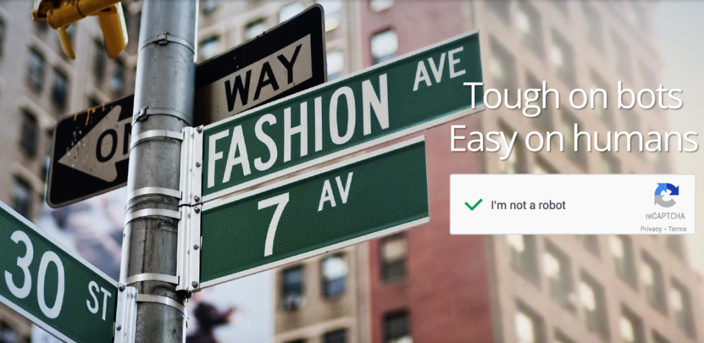
Spam is a pain in the arse. That’s pretty much something we all agree on. Some of it’s destructive; some malicious; most of it pointless; clogging up email; bloating CRM systems and messing up tracking and reporting.
reCAPTCHA, the most common counter measure, has long been a frustrating user experience, resulting in many an abandoned attempt to submit a web form. So when I heard about Google’s re-imagining of the reCAPTCHA I had to take a look.
So what is Google’s No CAPTCHA reCAPTCHA?
In announcing the release on their online security blog, Google claim that their new API, which ‘radically simplifies the reCAPTCHA experience‘, will enable users ‘to securely and easily verify they’re human without actually having to solve a CAPTCHA. Instead, with just a single click, they’ll confirm they’re not a robot‘.
Sounds great. Check out their video, it’s worth it for context:
Sounds a little geeky, but I was genuinely excited to give this a try.
So does Google’s No CAPTCHA reCAPTCHA reduce spam?
To test it, we implemented the reCAPTCHA on a lead generation form on our online accounting website.

And the impact? Did it reduce spam?
Yes. It did, but it also had a rather painful unintended consequence – it killed genuine conversions.
In the interest of fairness, it’s worth saying this isn’t the most robust of evaluations – ideally tests should run longer, with more data. It ran for a full 24 hour period before we removed it. Given the numbers, I wasn’t prepared to keep it running.
So what happened?
If we compare the 24 hours with the reCAPTCHA versus the 24 hours prior without the reCAPTCHA, I can confirm it had the desired effect on the spam. Gone. Happy days.
Regarding conversions, lets take a look at some observations from studying the page and form data:
- The pageviews for the two days were very similar
- The percentages of unique users clicking the form submit button (‘Get started’) were practically identical over the two days
This suggests that the presence of the reCAPTCHA wasn’t off-putting to visitors. Those who wanted to sign up, would still try and do so regardless.
So far, so good.
The problem comes when you dig further into the conversion data. The number of successful form submissions FELL by 73% from one day to the next.
If we look at the number of unique users clicking on the form submit button and compare against the total number of clicks on the button we find our problem. Once the Google reCAPTCHA was added to the page the number of times the button was clicked DOUBLED – from an average of 1.7 times to 3.4 times.
Why? I can’t be sure, but I have a theory.
3 reasons why No CAPTCHA reCAPTCHA kills conversions
1. The appearance isn’t customisable
As far as I can tell, the appearance of the reCAPTCHA is not customisable. It can only look like this:

As such, I don’t think it looks like part of the form. It looks more like a banner.
2. The checkbox is unconventional
I’m not convinced the ‘check box’ looks like a typical check box. It just looks like a square and as such a user may not be aware that they have to click it.
3. The copy is ambiguous
I have a concern about the ‘I’m not a robot‘ text. Does the average person know what a ‘robot’ actually is in this context? Considering you’re reading this, I’m assuming you’re a web marketer or pretty tech-savvy. You know what a robot is, but are you an ‘average’ user?
The text also doesn’t have any instruction. Nothing tells you to check the box, so you have to work it out. In the words of Steve Krug, don’t make me think.
As such, my suspicion is that the ‘banner’ is ignored. The user believes they have completed the form and clicks the submit button. When nothing happens, the user continues to click the submit button thinking something is wrong with the website. This causes the number of form button clicks to double.
After a few clicks with nothing happening, they abandon the form and leave the site. Reduced spam, reduced customers.
Good effort, must try harder
I think Google’s intentions here are good. Everyone hates those old reCAPTCHAs. I’d happily never have to squint and cock my head to try and figure out another blurry photo of a house number just to access an online account. The new one does provide a better experience. I love the idea that they’re looking at the user’s entire engagement with the process – especially the mapping of a human’s jerky mouse movements that a robot struggles to recreate – but I think the execution needs more thought.
Personally, I’d rather any solution completely takes the onus off the user and is dealt with in the background by the technology. Less friction is not as good as no friction.
So, to quote their headline, ‘Tough on bots, easy on humans‘… yeah not so much Google. There’s a little more work to be done yet.
